Effective YouTube Thumbnail Design: Boost Views & Capture Attention
Ahh YouTube, the most popular answer to the question “what do you want to do when you grow up?” among many 10 – 17 year olds these days. When 500 hours of video are uploaded every minute, capturing your audience’s attention is where few succeed and most fail. While compelling content remains the backbone of any successful YouTube channel, the role of a well-designed thumbnail can’t be overstated. Think of your thumbnail as the front door to your video: it needs to be inviting, intriguing, and most importantly, reflective of the content that clicking on it will open. As the first thing viewers see, your thumbnail can make or break your video’s success, or even determine whether they see it at all. If you’ve ever wondered why some YouTube channels skyrocket in popularity while others languish in obscurity, you’re not alone. The answer often lies in a nuanced blend of compelling content and strategic marketing, a key component of which is the mighty thumbnail. These miniature masterpieces serve as your video’s first impression, influencing whether viewers will click through or scroll past.
But what makes a thumbnail effective? There’s plenty of “tips and tricks” out there to immerse yourself in, and it can be difficult to separate the guff and the fluff from the good stuff. Drawing upon expert advice and industry best practices, we can identify effective YouTube thumbnail design. From the crucial drafting and ideation stages, through the nuanced choices of text, color, and graphics, and right up to the post-publishing evaluation and testing, there are a maze of decisions that lead to a thumbnail that not only captures attention but also boosts views. So, whether you’re a seasoned YouTuber or a novice looking to make your mark, let’s take a minute to explore how you can transform your thumbnails into click-worthy works of art that amplify your channel’s success.
The Power of Eye-Catching Visuals: How to Design Thumbnails that Grab Attention
Images play a fundamental role in grabbing attention amidst the noisy online landscape. Thus, it’s essential to focus on creating eye-catching visuals that stand out from the crowd if you’re looking to attract viewers and boost views.
To begin with, choose a main image that accurately represents the content of your video. This image should be clear and visually appealing, making potential viewers curious about what lies within the video. Additionally, use bold colors and contrasting elements to make your thumbnail pop on the screen. Think about what might appear next to your thumbnail on a search results page. Is your thumbnail design bright and contrasting enough to stand out?
Next, decide whether or not you want to include text in your thumbnail. Until recently, common opinion was that text in thumbnails is redundant, as the title should be able to speak for itself. This is proving to not be settled science as time goes on, and there are plenty of ways in which text can be artfully incorporated into your thumbnail design, especially if it plays off of or complements the video title. Keep it short and simple while using a font style that is easy to read at various sizes. A catchy title or intriguing keyword can entice users into clicking on your video over others in their feed.
Lastly, when designing thumbnails for YouTube videos, ensure consistency across all of your content’s branding elements like color scheme or logo placement, but also STYLE – this will help create a cohesive visual identity for your channel.
By following these tips and experimenting with different designs, you’ll be able to grab viewers’ attention and increase engagement with each enticing thumbnail you create.
Designing Thumbnails that Tell a Story: Conveying your Video’s Message in a Single Image
Choosing Relevant Visuals to Design Thumbnails that Tell a Story
Crafting compelling thumbnails is crucial for capturing attention and boosting views on YouTube. By conveying your video’s message in a single image, you can entice viewers to click and watch. Viewers see their time as precious, they’re not going to waste precious minutes on a video that their instinct tells them isn’t worth it. What informs that instinct before they have watched a single second? Three things: 1) Title, 2) Thumbnail, and 3) Hover Play Preview (the opening few seconds of your video, which should be almost as visually engaging as your thumbnail.
When designing a thumbnail, it’s essential to choose visuals that accurately represent the content of your video. Select an image that provides a clear indication of what viewers can expect when they click play. This will help grab their attention and ensure they have realistic expectations about the video’s topic or storyline.
Creating Intrigue with Text and Graphics
In addition to relevant visuals, incorporating text and graphics into your thumbnail design can add intrigue and enhance its storytelling potential. Consider using bold fonts or catchy phrases that highlight key aspects of your video’s message while ensuring readability even at smaller sizes.
The Psychology of Clicks: Understanding Viewer Behavior to Optimize Thumbnail Design
When it comes to optimizing YouTube thumbnail design, understanding viewer behavior is key. By tapping into the psychology of clicks, creators can create thumbnails that captivate their audience and boost views.
- Visual Appeal: Humans are naturally drawn to visually appealing images. Utilizing vibrant colors, high contrast, and eye-catching graphics in a thumbnail can make it stand out amongst other videos on the platform. Before you talk yourself out of vibrant colors on account of your brand – don’t! Talk to an experienced designer. Even the most drab brand standards can be hacked to create vibrant thumbnails.
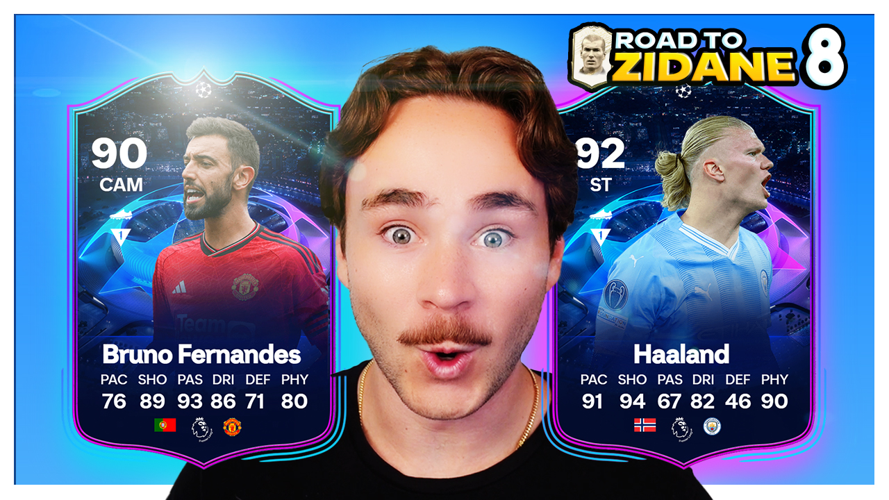
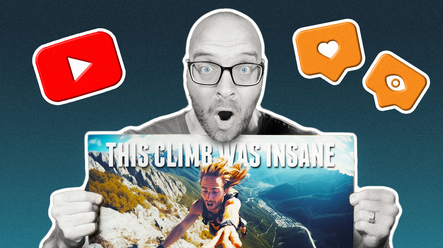
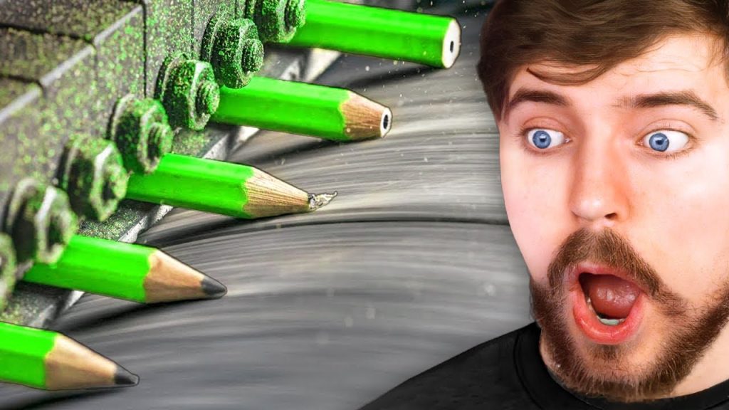
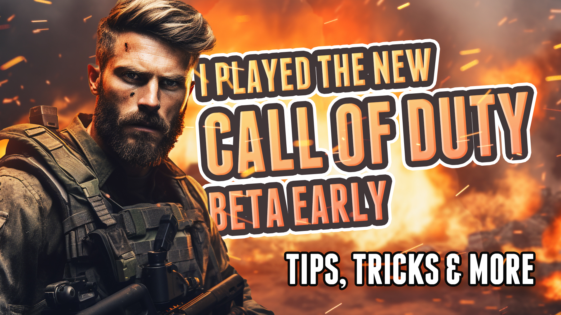
- Emotional Connections: Connecting with viewers on an emotional level can greatly influence their decision to click on a video. Incorporating emotions such as happiness, surprise, or curiosity in a thumbnail can pique their interest and compel them to watch. It’s why *SHOCKED FACE* is so common among popular youtube thumbnails, especially in the gaming scene. (You’ll now forgive me for the *I promise* tongue-in-cheek featured image for the post.
- Highlighting Value: Convincing viewers that your video offers valuable content is crucial. Thumbnails should showcase the benefits or knowledge they will gain by watching the video through text overlays or clear visuals that indicate what they can expect.


Understanding these psychological factors allows creators to optimize their YouTube thumbnail designs and ultimately increase their chances of capturing attention and boosting views.
Thumbnail Design Do’s and Don’ts: Proven Techniques for Boosting Views and Increasing Click-Through Rates
DO keep it visually striking
Capture the attention of viewers by using bright colors, bold fonts, and eye-catching imagery in your thumbnail. Make use of textures and subtle effects to create the illusion of depth. Using leading lines and visual hierarchy to draw the eye toward what you want the viewer to see. Make sure the design is clear and easily understandable even when viewed in a small size.
DON’T mislead your audience
Avoid using misleading or clickbait thumbnails that don’t accurately represent the content of your video. Building trust with your viewers is essential to maintaining engagement and attracting loyal subscribers.
DO include text overlays
Add text overlays to provide additional context or create intrigue about what the video entails. Use concise headlines or compelling questions to entice viewers into clicking on your video.

DON’T overcrowd the thumbnail
Keep your thumbnail simple and uncluttered. Avoid including too many elements that can distract from the main message or make it difficult for viewers to understand what they can expect from watching your video.
DO A/B test different designs
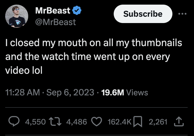
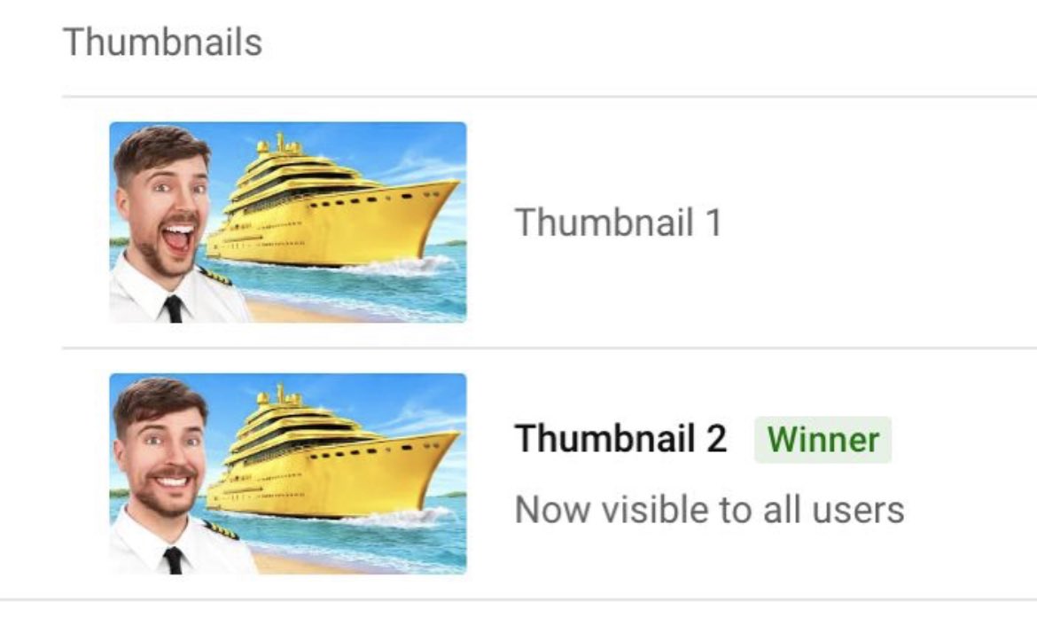
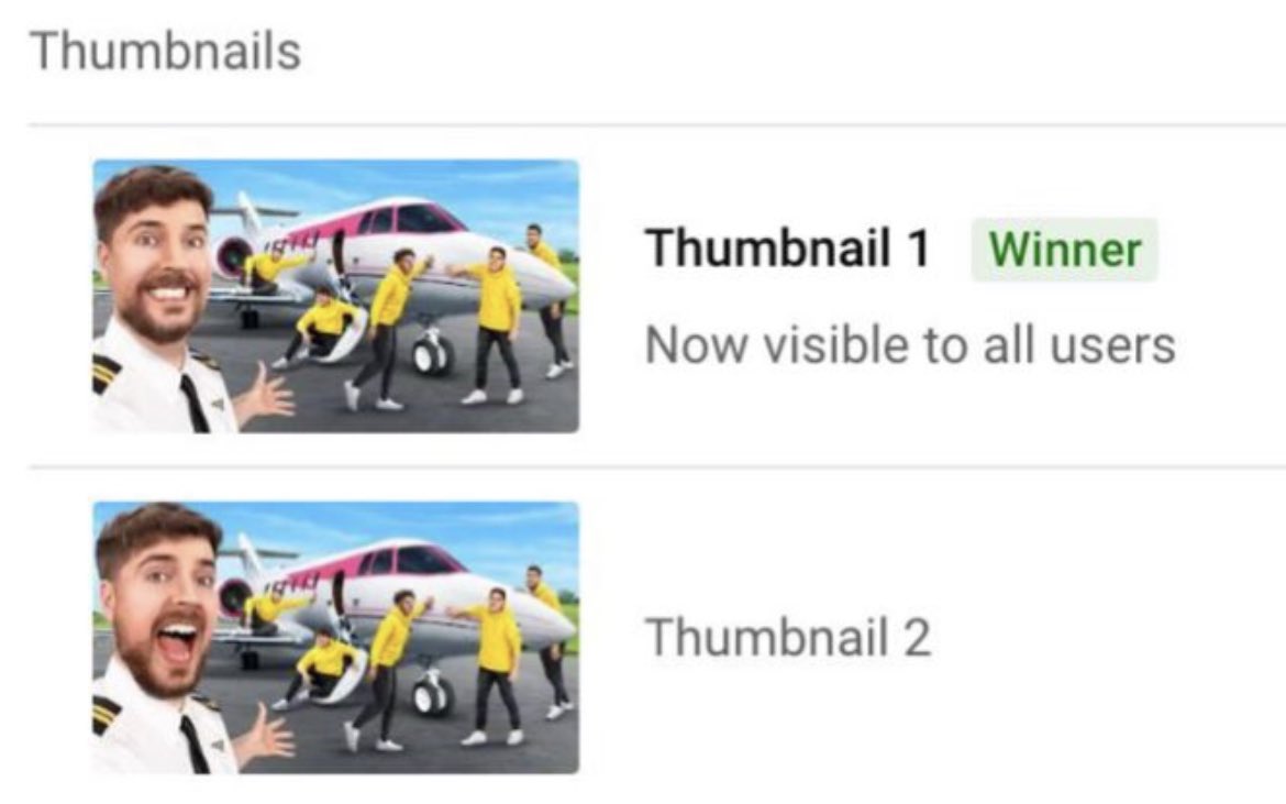
Experiment with various thumbnail designs to see which ones resonate best with your target audience. Analyze metrics such as click-through rate (CTR) and engagement rates to determine which thumbnails are most effective at boosting views. Mr Beast hilariously used the new Youtube A/B thumbnail test feature to discover that viewers are more likely to click on his video if his mouth is closed.
DON’T forget about mobile optimization
With a significant portion of YouTube views coming from mobile devices, ensure that your thumbnails are optimized for smaller screens. Test how they appear on various devices before finalizing them for maximum impact.
Implementing these techniques will increase the likelihood of attracting clicks and encouraging viewership on YouTube. If you lack the time or design skills to create your own thumbnails, consider hiring a designer. Thumbnail rates are more affordable than you might think and provide a tremendous return on investment when paired with solid content.